

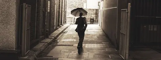
 © Anna Averianova
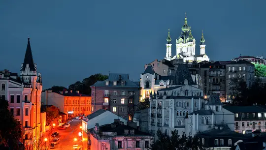
 © okostia
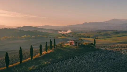
 © designfactory
Over
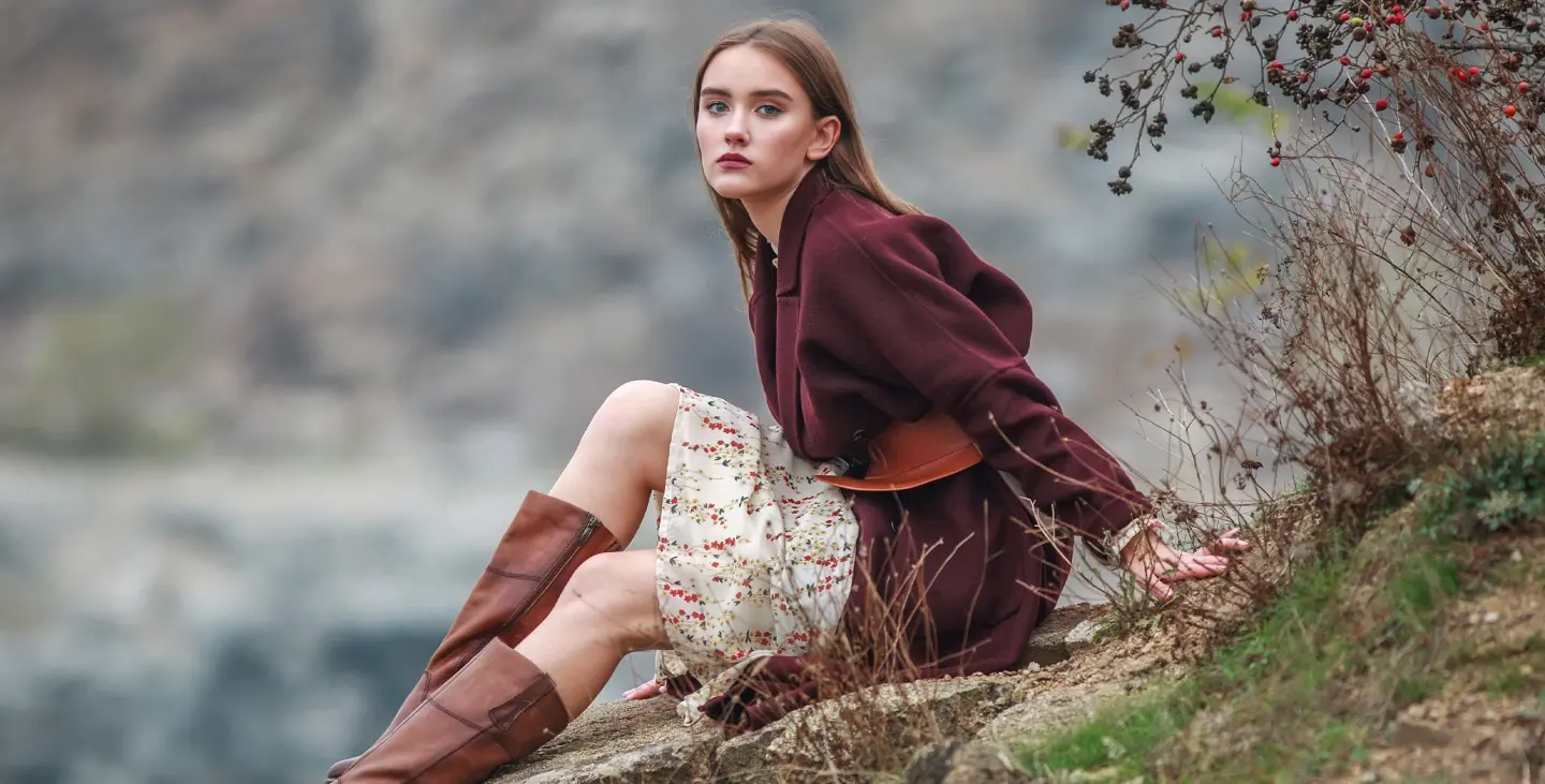
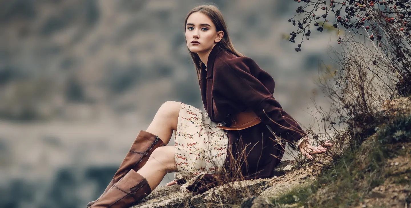
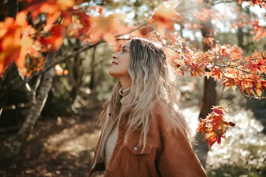
These LUTs don't turn summer into fall – they refine the autumn you already captured. The 25 looks in this pack tame the loud, oversaturated oranges and yellows of a typical autumn shot and replace them with a calmer, more cinematic palette: rust instead of neon orange, burgundy instead of fire-engine red, muted teal skies instead of postcard blue. Some looks lean warm and filmic, others cool and moody, and a couple push the orange for when you want the season to glow. Made for foliage, forest walks, harvest scenes and autumn portraits.
Wat is inbegrepen
25 LUTs
Compatibiliteit


Maak foto's zoals deze
Met behulp van de meegeleverde RAW-bestanden oefent u gemakkelijk retoucheertips en leert u hoe u dergelijke foto's kunt maken.
Het Verhaal
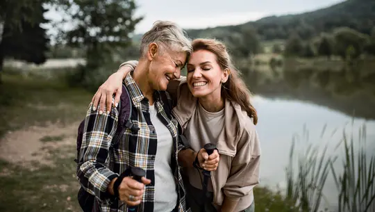
 © okostia
I wanted autumn images to feel the way the season actually feels: quieter, softer, a little moody. Yet most autumn photos end up the opposite – oversaturated, with oranges that glow like highlighters and skies that look digitally pumped. These LUTs are my answer to that.
Most of the looks take the edge off intense colors and add a gentle grade – some warm and earthy, some cool and atmospheric. A couple go the other way and deepen the orange for a richer seasonal glow.
What these LUTs are not: a summer-to-fall converter. They work with the colors that are already in your photo. Green leaves stay green; they just become more refined.
Works best with: autumn foliage, forest and park scenes, pumpkins and harvest still lifes, cozy interiors, and outdoor portraits with warm light.
Tip: Every look can be dialed down with the amount slider. If a grade feels too strong, reduce it rather than switching LUTs – the mood stays, the effect gets subtler.
Gerelateerde Producten




Maker
Kathrin Federer
Digital Artist & Architect of Visual Dreams
Born in Switzerland, Kathrin Federer has established an impressive art career from her base near Zurich. Initially, an abstract painter, her 2017 encounter with Photoshop revolutionized her creative process. Kathrin's ability to realize her visions sets her apart in the art world, and she has become a living source of inspiration to many.
Skillfully employing a diverse range of professional design software and various digital enhancement tools, Kathrin constructs breathtaking artworks. Her creative toolbox extends beyond Photoshop and Illustrator, embracing the full spectrum of digital technologies to bring her vibrant artistic concepts to life. These involve a fusion of her photographs, 3D objects, vectors, and her original digital elements, infusing her vibrant artistic concepts with life. Characterized by continuous growth and refinement, her art maintains a signature crisp style that is distinctively hers, transforming any setting with its profound visual impact.
Kathrin Federer draws her inspiration from a variety of sources. Everyday subjects, images, and her own vivid imagination often serve as the basis for her art. She has the unique ability to create an entire environment around a single inspirational object. This can be anything from grazing sheep in a pasture to a snapshot or a child's drawing. Kathrin's works reflect a part of her soul and are meant to take the viewer on a journey, make them think, or even just make them smile. She hopes to exude calm and serenity with her minimalist creations and offer a respite from the fast-paced modern world.
Kathrin Federer's style is a blend of minimalism and nature, with an occasional dash of humor, resulting in haunting, dreamlike scenarios. Her digital art is characterized by its clear depiction and unique compositions. Kathrin's meticulous attention to detail and perfectionism are evident in each of her works. She often incorporates elements such as animals, trees, mountains, and architectural features into her works. Kathrin's color choices and arrangement of elements in her works are carefully considered, often guided by intuition, and supported by a deep understanding of color theory and design principles.
Veelgestelde vragen
Heb je nog extra vragen of wil je gewoon wat advies?
Neem contact op met ons supportteam